Generalized Linear Models in 3D
Source:vignettes/articles/generalized_linear_models_3d.Rmd
generalized_linear_models_3d.RmdIntroduction
A multiple
linear regression creates a flat regression surface. A multiple
linear regression with an interaction term can be depicted as a
curved regression surface with linear marginal effects. A
generalized linear model (glm) takes a linear component
as a variable in a nonlinear function, creating a curved regression
surface with nonlinear marginal effects. The functionality of
add_3d_surface() and add_marginals() in a glm
is the same as in a linear regression model. However, the visuals are
sufficiently different to merit a separate description.
This article demonstrates a binomial model and a Gamma model.
- At this time, regress3d has been tested on binomial models, negative binomials, and Gammas, but it should work for all generalized linear models.
- Interaction terms are also allowed in the graphics for generalized linear regressions.
- The function
add_jitter()is demonstrated in the example of a binomial glm.
Setup
The package regress3d is built on the syntax of plotly in R. Both libraries are called in the initial setup.
Logistic Regression
Data
The variables in the regression are county level measures from 2016. For pedagogical purposes, the variables are chosen to emphasize the s-shape of a logistic regression.
-
plurality_Trump16: a binary variable indicating whether the plurality of a county voted for Trump in 2016. -
any_college: the percent of adults in the county that had ever enrolled in college, regardless of whether they graduated. -
prcnt_black: the percent of the county that identified as Black in the 2016 census.
2D plot of a logistic regression
For reference, a two dimensional plot of logistic regression can look like this.
- The outcome variable,
plurality_Trump16, is binary. We useggplot2::geom_jitter()to reveal the density of observations for counties that have very few Black residents. - In this case the explanatory variable
prcnt_blackis continuous. - The logistic regression model requires an s-shape for the predicted probabilities so that they cannot exceed the range .
county_data %>%
  ggplot(aes(x = prcnt_black, y = plurality_Trump16)) +
  geom_jitter(width = 0, height = 0.1, alpha = 0.5) +
  geom_smooth(method = "glm", method.args = list(family = "binomial")) +
  theme_classic()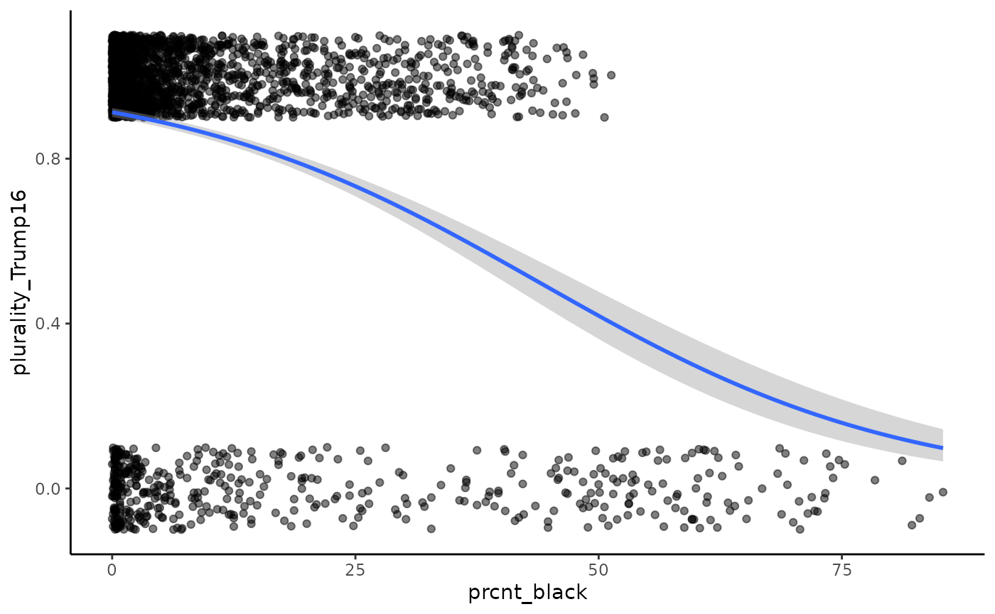
3D plot of a logistic regression
The three dimensional plot adds education, any_college,
to the logistic regression depicted above.
mymodel <- glm(plurality_Trump16 ~ any_college+prcnt_black,
               data = county_data,
               family = "binomial")

plot_ly( data = county_data,
         x = ~any_college,
         y = ~prcnt_black,
         z = ~plurality_Trump16) %>%
  add_jitter(x_jitter = 0, y_jitter = 0, z_jitter = 0.1,
             size = 1, color = I('black'))%>%
  add_3d_surface(model = mymodel, ci = T) %>%
  add_marginals(model = mymodel, ci = T)
More on marginal effects
In a linear regression, the marginal effect of stays constant for all values of . This is true for generalised linear models as well. However, note that for a given range of , the magnitude of the change in the outcome can depend on the value of . This is depicted in the image below, where the marginal effects of education () are shown for two different values of % Black ().
This is depicted in the image below. Each call to
add_marginals() specifies a different constant value for
the marginal effect of % Black
()
using the argument x2_constant_val.
plot_ly( data = county_data,
         x = ~any_college,
         y = ~prcnt_black,
         z = ~plurality_Trump16) %>%
  add_jitter(, x_jitter = 0, y_jitter = 0, z_jitter = 0.1,
             size = 1, color = I('black'))%>%
  add_3d_surface(model = mymodel, ci = T) %>%
  add_marginals(model = mymodel, ci = T, omit_x2=T,
                x1_direction_name = "Marginal effect of education<br>with % Black held constant at its mean 8.75%") %>%
  add_marginals(model = mymodel, ci = T, omit_x2 =T,
                x2_constant_val = 50,
                x1_direction_name = "Marginal effect of education<br>with % Black held constant at 50%")
Click, hold, and drag the regression surface to spin it. See the article on linear models for more information on how to manipulate this graphic.
Numeric regression results
This graphic corresponds to the following numerical regression results.
| plurality of county voted for Trump in 2016 | ||
| County college experience | -0.119* | |
| (0.006) | ||
| % Black | -0.054* | -0.086* |
| (0.003) | (0.004) | |
| Constant | 2.348* | 9.228* |
| (0.069) | (0.406) | |
| Observations | 3,139 | 3,139 |
| Note: | * p<0.05 | |
Gamma Model
Data
The variables in the regression are county level measures from 2016.
-
median_income16: county level median income. This outcome variable is chosen to allow for a Gamma model, as it is positive continuous, and right skewed. -
any_college: the percent of adults in the county that had ever enrolled in college, regardless of whether they graduated. -
prcnt_black: the percent of the county that identified as Black in the 2016 census.
The regression is weighted by pop_estimate16, the number
of people in a county, to capture the influence of large counties.
2D code and graphic
For reference, a two dimensional plot of Gamma regression can look like this.
county_data %>%
  ggplot(aes(x = any_college, y = median_income16)) +
  geom_point() +
  geom_smooth(method = "glm", method.args = list(family = "Gamma")) +
  theme_classic()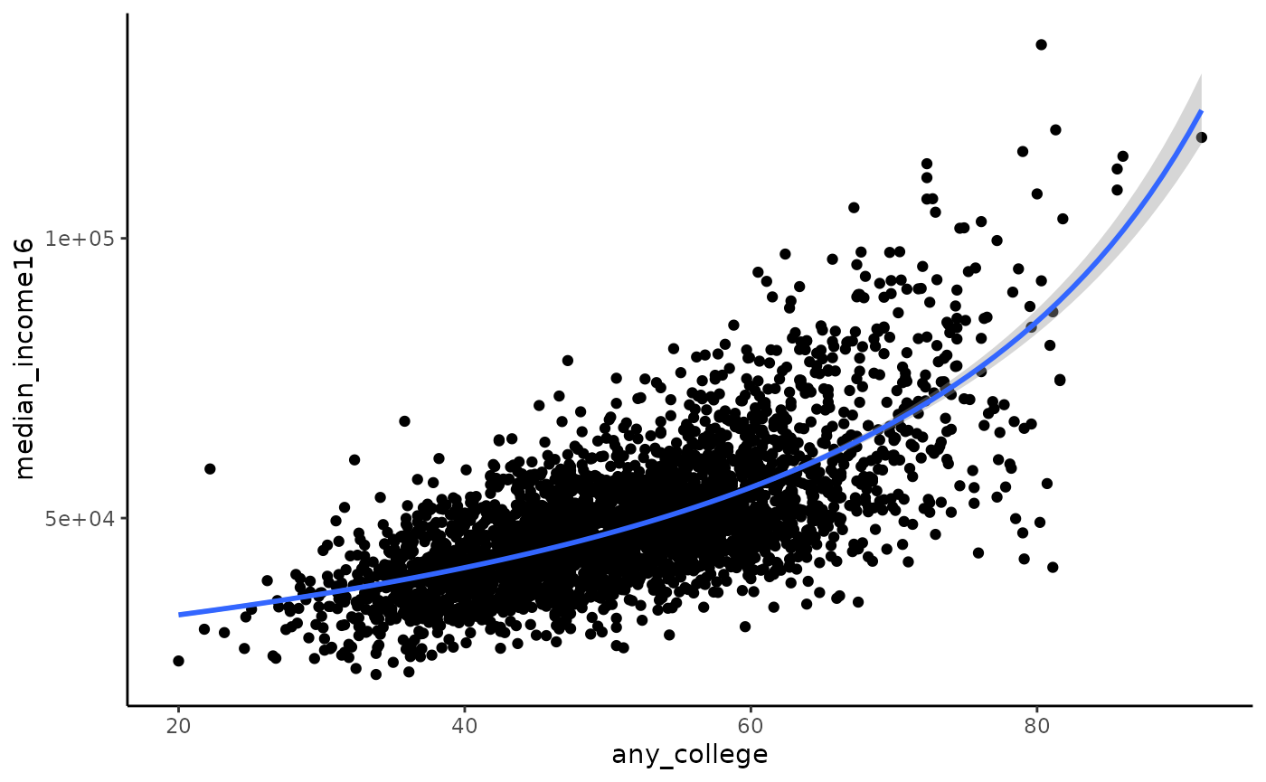
3D code and graphic
The three dimensional plot adds prcnt_black to the Gamma
regression depicted above as well as weights for the county
population.
The code starts by specifying a model. We then create a
plotly::plot_ly() object using the same variables. Next
layer on the scattercloud, 3D surface, marginals, and labels. Note that
regression notation uses
and
to represent the explanatory variables, and
for the outcome. The plotly command denotes the explanatory variables as
and
,
and the outcome variable is
.
county_data$median_income16_1k <- county_data$median_income16/1000

mymodel <- glm(median_income16_1k ~ prcnt_black +any_college,
               data = county_data, weight = pop_estimate16, family = Gamma)

plot_ly( data = county_data,
         x = ~prcnt_black,
         y = ~any_college,
         z = ~median_income16_1k) %>%
  add_markers(size = ~pop_estimate16, color = I('black')) %>%
  add_3d_surface(model = mymodel)%>%
  add_marginals(model = mymodel)
Click, hold, and drag the regression surface to spin it. See the article on linear models for more information on how to manipulate this graphic.
More on marginal effects
In a linear regression, the marginal effect of stays constant for all values of . This is true for generalised linear models as well. However, note that for a given range of , the magnitude of the change in the outcome can depend on the value of . This is depicted in the image below, where the marginal effects of education () are shown for two different values of % Black (). In this case, a meaningful change in the curvature of the marginal effect occurs at the extreme end of the education range where there are very few observations.
plot_ly( data = county_data,
         x = ~prcnt_black,
         y = ~any_college,
         z = ~median_income16_1k) %>%
  add_markers(size = ~pop_estimate16, color = I('black')) %>%
  add_3d_surface(model = mymodel, ci = T) %>%
  add_marginals(model = mymodel, ci = T, omit_x2=T,
                x1_direction_name = "Marginal effect of % Black<br>with education held at the mean 51.24%") %>%
  add_marginals(model = mymodel, ci = T, omit_x2 =T,
                x2_constant_val = 80,
                x1_direction_name = "Marginal effect of % Black<br>with education held constant at 80%")